Ux Mockup Tester
So to empower UX designers, I did create a simple tool that will highlight some key concepts about UX and image recognition.
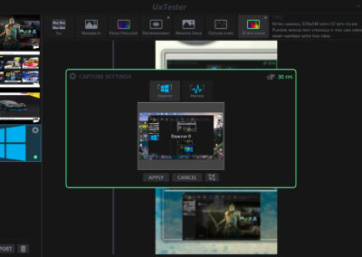
Simply by analyzing then apply some filter on images, video, and even a live capture of your window.
This tool is part of the toolbox that I carry with me. I do share this tool with people on my project to increase the player experience as a whole.
Artists and gameplay can have instant feedback while working.
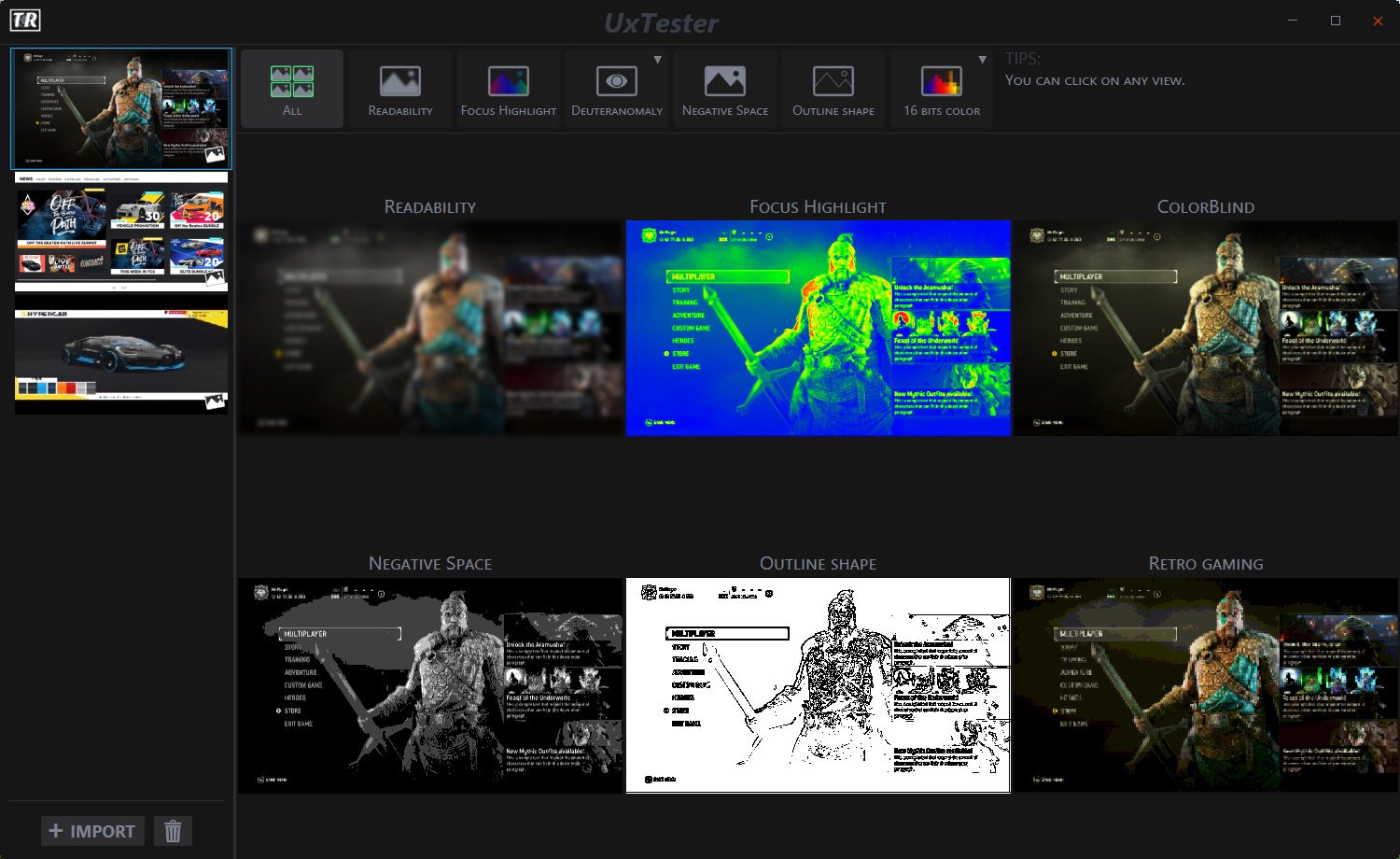
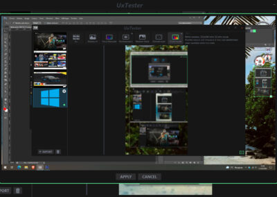
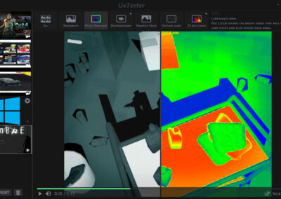
The version your are looking right now is the 3rd iteration of this software that received an artistic pass from @Alex Batista. The layout is very simple, a list of assets that can be pictures, videos and screen capture.
then in the middle of the main render view, which will change accordingly to the selected filter.
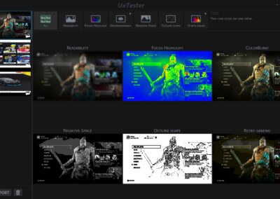
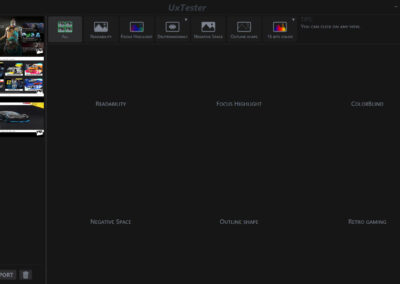
On the current image, the user is watching the summary view, which displays all views at once.
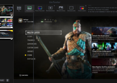
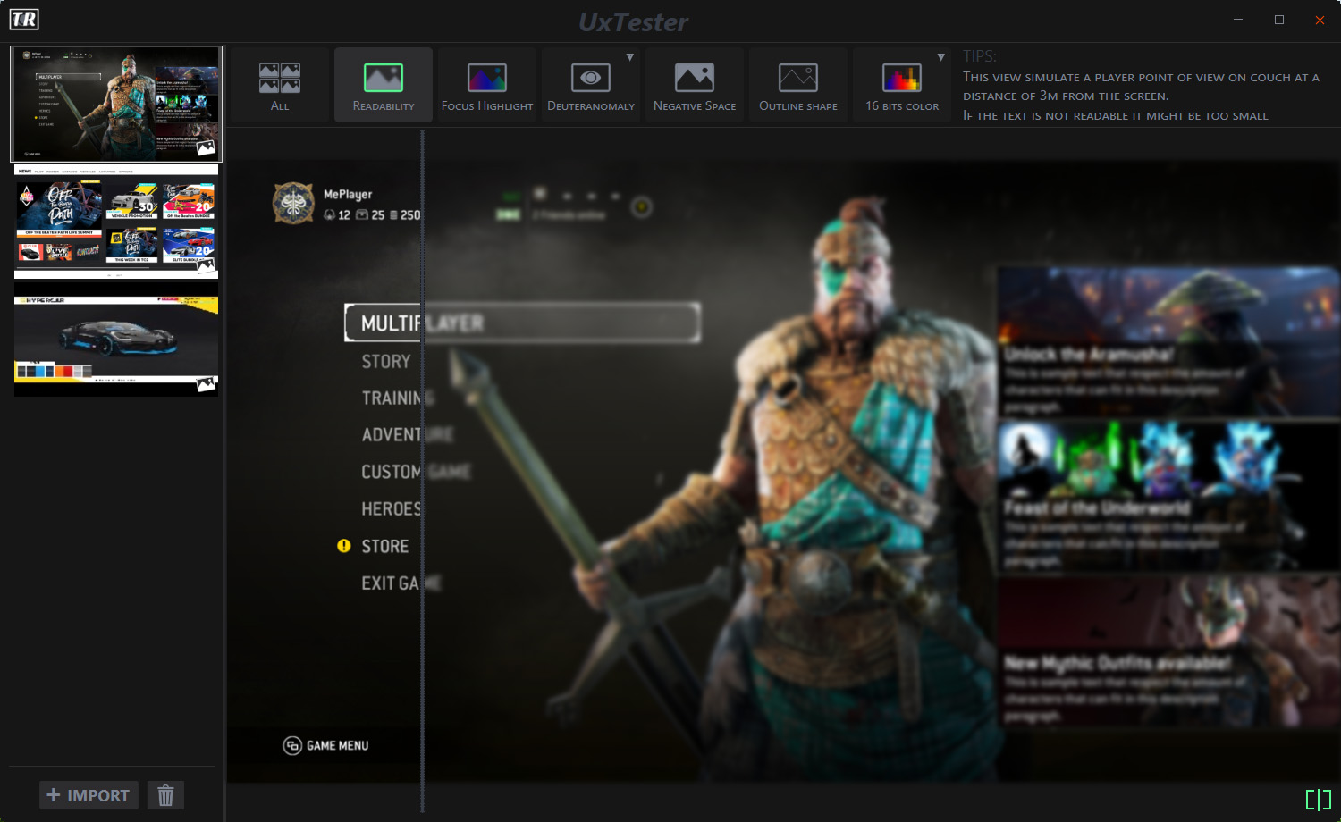
In the current case, the view is a readability view comparison, the concept is simple.
How do we simulate the perception of a player on TV from 3 meters away ?.
Indeed when developing on PC we work very closely to the screen, so small font does not appear inappropriate to us.
With this view,
if the text is not readable… it’s too small.
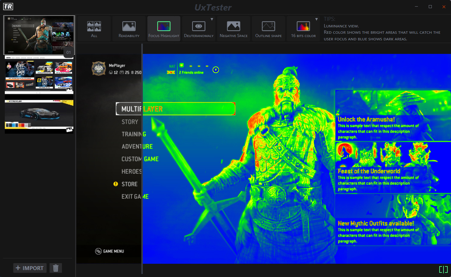
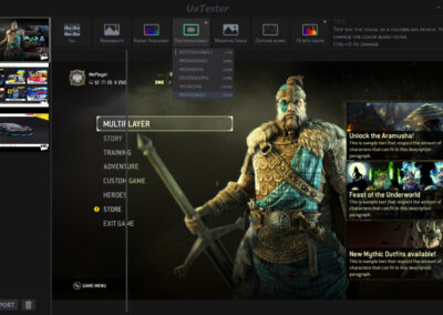
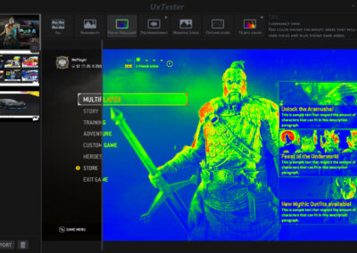
This view will highlight the contrast by creating a heat map representation of the image.
Red means hot so White and Blue means cold so black.
The shader will check the luminance value to populate that view.
In this case, hot spots will be more likely to attract the player’s focus.
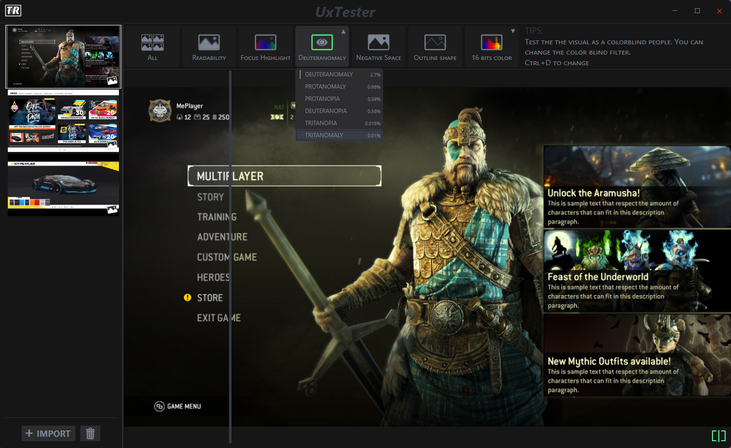
One big focus on the AAA games is currently about accessibility features. Supporting colorblind people to help them enjoy our games is one of them.
This view on top of providing up to 6 different colorblind filters will provide some statistics about this disability.
Because the difference between a good tool and a great tool is also the UX, I did add multiple shortcuts like CTRL+D to cycle through the colorblind filters.
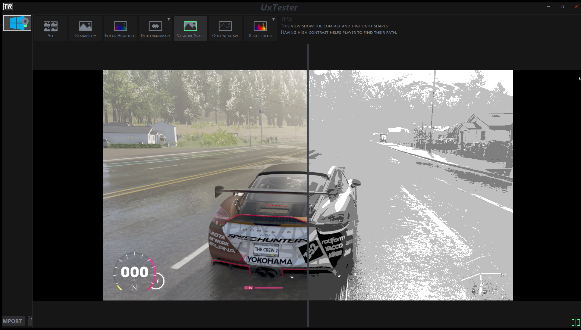
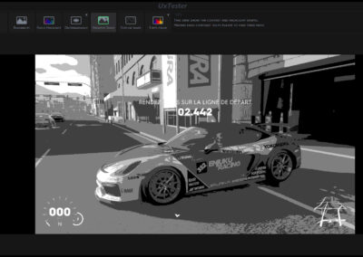
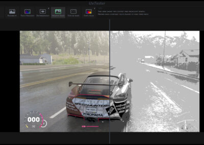
This view is very useful to analyze the level design and gameplay pathfinding issues.
Like:
Why he is not taking this path !!!
If while playing The Crew 2 you have a hard time driving, it’s because the road blends with the environment.
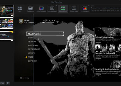
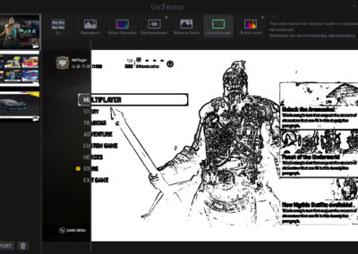
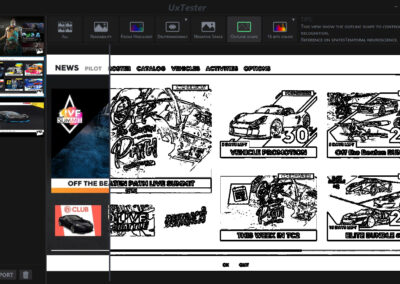
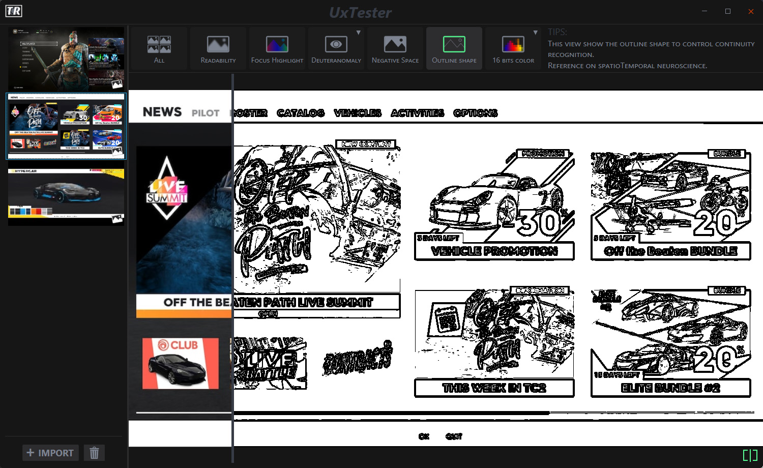
The outline view will help to assure your visual elements are grouped accordingly.
Because this view will ignore colors, it will act more like a wireframe representation of your visual.
Let you quickly check shape continuity and feature groups.
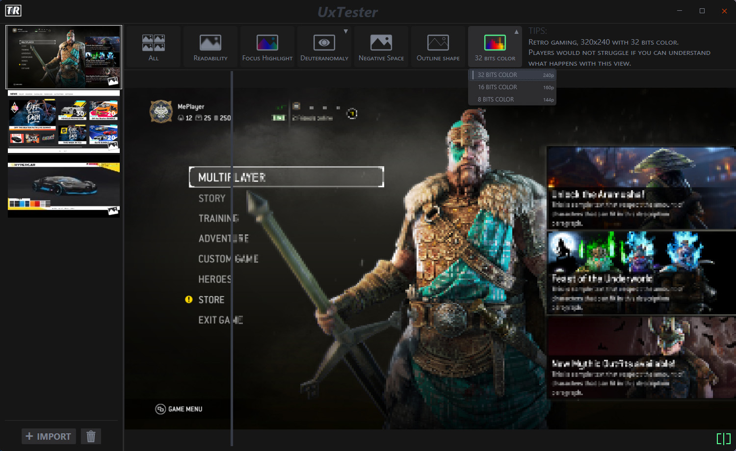
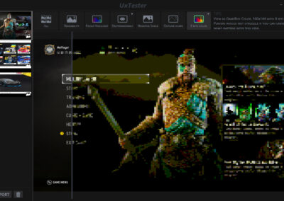
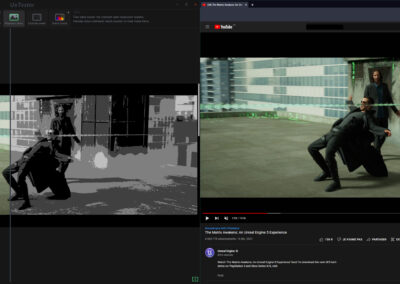
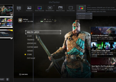
There are 3 available modes and my preferred is the 8 bits retro gaming view you will see in the next image.
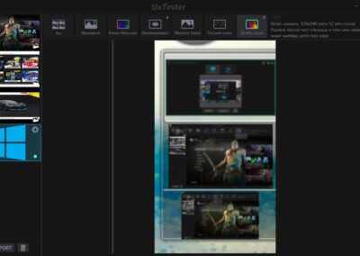
Because of the support of the live capture,
You can actually play your game with that view.
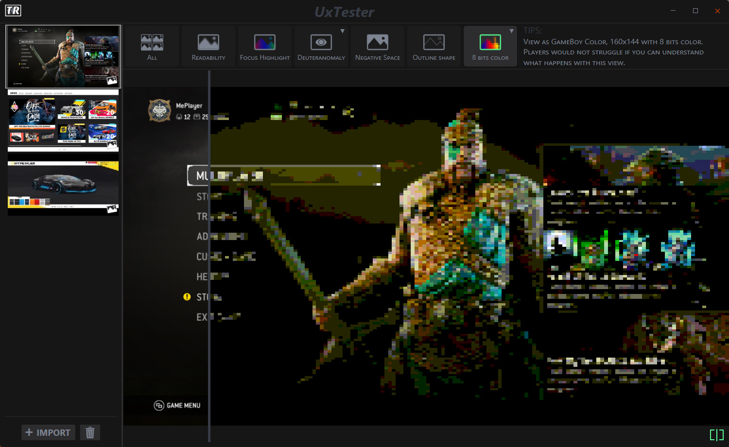
Try it by yourself
I have developed this tool in my free time on WPF.
It is not open source and no support is provided.
But you can use it for free.
